



PORTFOLIO
About Me

I’m William Hochstetter, a marketer entering my final semester at James Madison University, about to start my career as a professional marketer. I’ve been a graphic designer and writer for over ten years, first as a hobby and now professionally, and along the way I’ve also taken on leadership roles, managing teams and shaping marketing strategy to grow awareness and brand exposure.
At my core, I’m a design-focused creative, and I’ve got the work to back it up.
Certifications



- Certiport Digital Marketing Certification
- Several Canva certifications
- 10+ years of graphic design experience
My Tools
 Illustrator
 Photoshop
 InDesign
 Photopea
 Procreate
 Canva
The Work
-
Peter Pan Day Schools2026Marketing intern
-
James Madison Esports2025–2026Treasurer and marketing lead, organization leadership
-
Statistex2023Design consultant and graphic designer
-
Valorant @ UVA2021Logo design for a student association
-
Team Dignitas2021–2022Editorial Intern, later Senior Writer
-
Copywriting Course2026Ad concept and copy
-
Freelance2018–2021Graphic design and writing
-
Painting & PhotographyOngoingPersonal work
Each project gets its own chapter. They are being built out one at a time.
Chapter One
Peter Pan Day Schools
This summer, I worked as a marketing intern for Peter Pan Day Schools, a business that had been running for 60 years almost entirely on word of mouth. My job was to help bring it into the modern day: building out online advertising and SEO for the first time, creating marketing materials, rebranding the company, running social media, and overhauling their website.
 Peter Pan
Body Font
Roboto AaAaAaDisplay Font
Chelsea Market AaThe brand identity shown here (logo set, color palette, and typography) was part of that rebrand. I wanted something that felt warm and trustworthy for parents while still reading as fresh and current, since the old brand hadn’t been touched in decades.
Beyond the visual identity, I redesigned and modernized preschools.net to streamline how the business operates day to day, managed eight social media accounts across four locations, and worked directly with advertisers to improve visibility and reach using engagement metrics. Together, this work helped drive meaningful enrollment growth, with increased enrollments from social media resulting in thousands a month in revenue.
Chapter Two
James Madison Esports

I was selected for JMU Esports’ organization leadership, where I serve as treasurer and lead the marketing team. I manage the organization’s funds, and I oversee a marketing team of three across socials, branding, content, and event promotion.
One challenge I had to design around: campus rules only let us promote an event two weeks in advance, so it’s hard to stay visible all semester with just one push. I ended up running two promoted events a month, timed so the promo windows overlap and basically cover the whole semester. Flyers are the main tool, backed up by social posts.
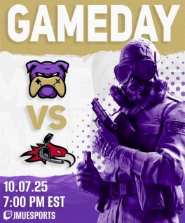
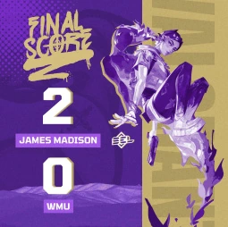
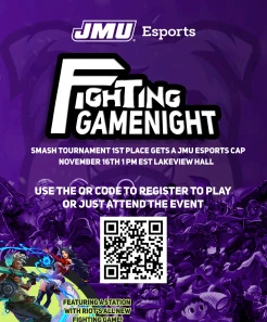
The graphics here came out of that system: gameday hype posts, final score recaps, and event flyers like the Fighting Gamenight promo with a QR code for registration. Everything is made in Photoshop and kept in the same purple-and-gold look so it reads as JMU Esports at a glance.
A reel that outran the roster
Short-form video does the reach the flyers can’t. This one, built around what our League team listens to and the champions they play, pulled 92.6K views and roughly 7,300 likes, comments, shares and saves, against a campus club audience a fraction of that size.
Chapter Three
 Statistex
I worked as a design consultant and graphic designer for Statistex, a gaming-focused analytical service, helping shape the company’s early visual identity: logo concepts, infographics, and social and web visuals.
The six mock-ups here were part of that early logo exploration. Design 1 was my favorite. The EX mark with a line graph running through it felt simple and on-theme for an analytics product. Design 2 came out of a collaboration with the founder, who wanted to work a train into the logo since EX was short for “Express.” I liked how it turned out visually, but conceptually it never quite landed: I couldn’t make the train read clearly without hurting the legibility of the EX. Design 4 didn’t really fit the brand’s vibe, but I still think it’s one of the more aesthetically pleasing options in the set.





I stepped back from the project that fall to focus on school, so Statistex eventually took its branding in a different direction. Still, these early concepts helped lay the groundwork for the product’s visual identity in its first months.
Chapter Four
Valorant @ UVA
I designed the logo for Valorant @ UVA, a student association for the game’s competitive community on campus.
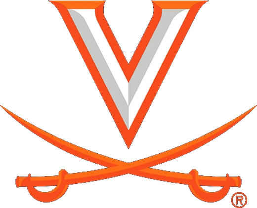


I wanted the mark to feel like it belonged to both worlds, pulling the crossed-sabers motif from UVA’s own athletics branding and combining it with Valorant’s angular “V” shape to land on something that reads as school spirit and gaming identity at the same time. Navigating UVA’s student association guidelines was a unique challenge that ended up forcing a creative but simple design.
It’s a small piece, but a meaningful one, and the logo is still in use today, a few years after I made it.
Chapter Five
Team Dignitas

I worked as an Editorial Intern and later Senior Writer for Dignitas, contributing to their newsletter aimed at gamers looking to improve. Alongside the writing, I interviewed professional esports athletes about their careers, routines, and mindset, and designed the graphics that ran with each piece.
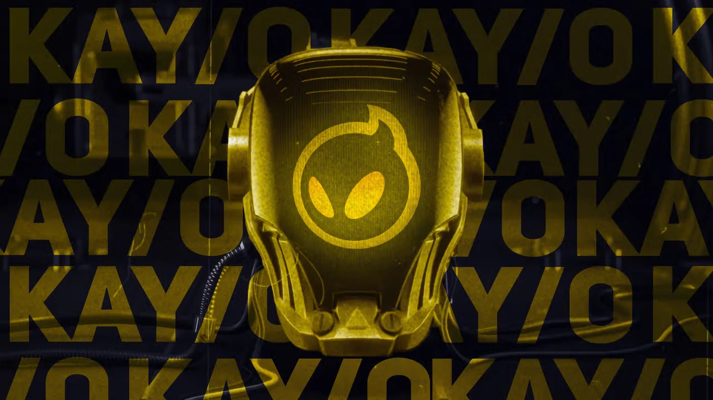
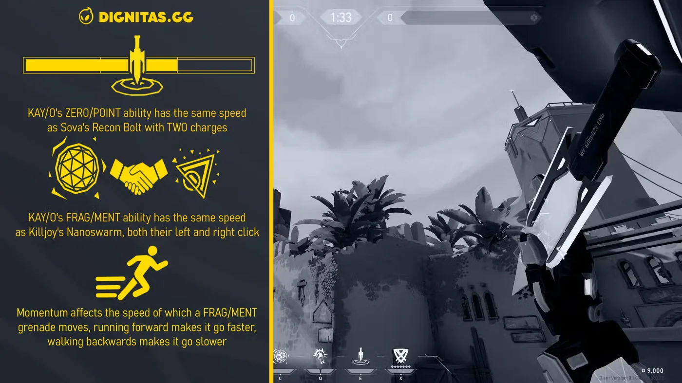
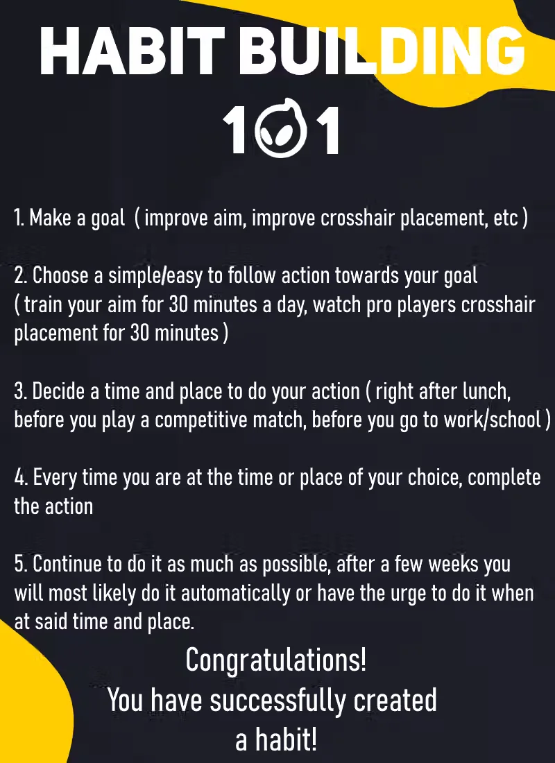
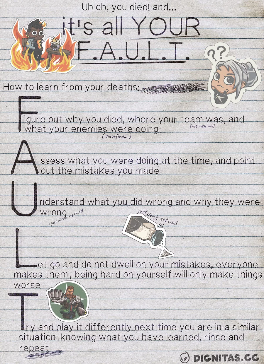
These are those graphics: article headers, explainers built out of in-game footage, and guides that had to land a point quickly in a feed. They hold up as an example of what I can do for social posts or smaller promotions where a full-time designer isn’t needed.
Chapter Six
Copywriting Course
For one of my marketing courses, we put together a batch of ad concept mock-ups, and this one ended up being my favorite of the bunch.
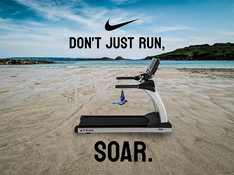
The idea was simple: take a piece of gym equipment and put it somewhere it doesn’t belong, like a treadmill on an empty beach at sunset, then let the copy do the rest. “Don’t just run, SOAR.” leans into that contrast, treating the treadmill less like equipment and more like a launch pad, with the bird mid-flight tying the line back to the visual.
It’s a small piece, but it’s one of my better examples of copy and image working together to sell a feeling rather than a product spec.
Student spec concept produced for coursework. Not affiliated with, commissioned by, or endorsed by Nike.
Chapter Seven
Painting & Photography
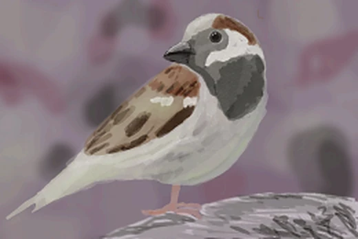
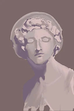
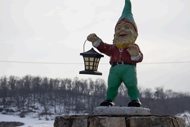
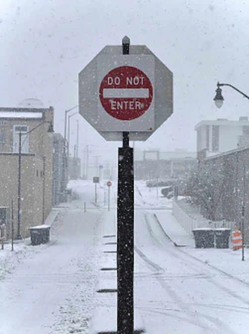
I’ve been drawing my whole life, and more recently picked up photography as another way to see and capture the world. I play cello too. None of it is for a client or a deadline. It’s just where my creativity goes on its own, and I think it shows in how I approach design: an eye for composition, patience for details, and a real love of making things.
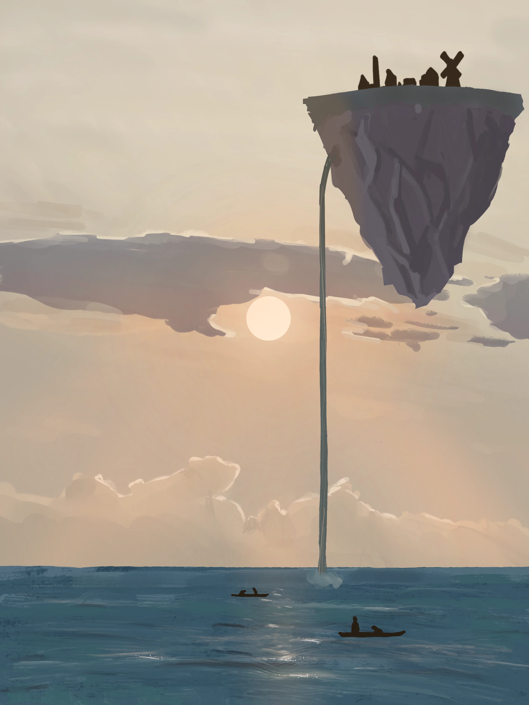
The pieces here are digital paintings and photographs from the past few years. Some were quick studies, others I spent real time on.